Perhaps this seems a bit basic, but it’s one of those things that’s essential to understand about photos before you start tinkering around.
How many times have you taken a picture and loved what you got, but weren’t pleased with the colors in the picture? What exactly is wrong with it? How do you go about fixing it? Some people have a natural eye for what colors are off, like my husband. Other people, myself included, need a bit of training. So, here you go.
All digital photos are made up of three colors: red, green and blue. It’s a color management system called RGB. But, wait! How are there thousands of colors then? Well, using a combination of reds, greens and blues, in varying amounts, will create a wide array of colors. Once you understand this, you begin to see how to fix a photo.
Most digital cameras today go heavy on the blues or greens. Film cameras, on the other hand, often tend to go heavy on the red. Either way, it’s not that hard to fix. But, you must understand their relationship.
If you decrease the red in a picture, it tends to increase the amount of green in a picture.
If you decrease the green in a picture, it will either increase the amount of red or blue in a picture, sometimes both. A word of caution, be very careful when adjusting the green in pictures. It’s easy to go overboard and your pictures will look fake.
If you decrease the blue in a picture, it tends to increase the amount of red in a picture and also has a side effect of making yellows stand out more.
So, how do you put this to good use?
First, find a picture you want to improve – trust me, most pictures could use it. I’m going to use this random picture I found in my family history files. I have no idea who these people are. I choose this picture because old pictures almost always have photo damage and it’s more obvious what’s wrong with the color. Open this photo in Photoshop.
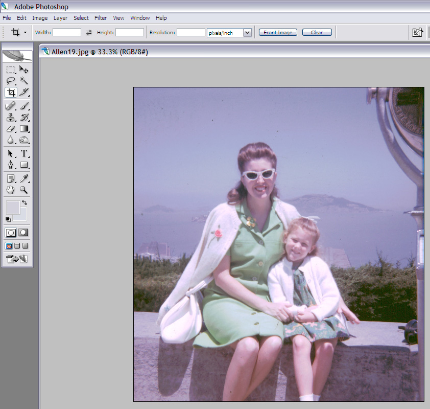
A quick look at this picture tells you it has too much blue. That means, we need to decrease the blue and probably increase the red to compensate. But, what if you’re still not sure which color is dominant? This is where a histogram comes in handy.
A histogram is basically a type of graph that shows frequency. In the case of photos, a histogram is how frequently a certain color appears in a picture. The histogram is divided into three parts. On the left, are the color frequencies of the shadows of the picture. In the middle are the midtone color frequencies. On the right, are the highlights color frequencies.
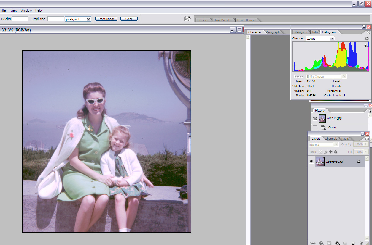
To open the histogram in Photoshop, go to ‘Window’ and select ‘Histogram.’ In the Histogram pallet, select ‘Channel’ and select ‘Colors.’ This shows a funky graph that looks like a rainbow mountain range. The colored peaks are the areas that have a lot of a certain color. As you can see in this picture, there is a lot of blue and red in the midtones/highlights.

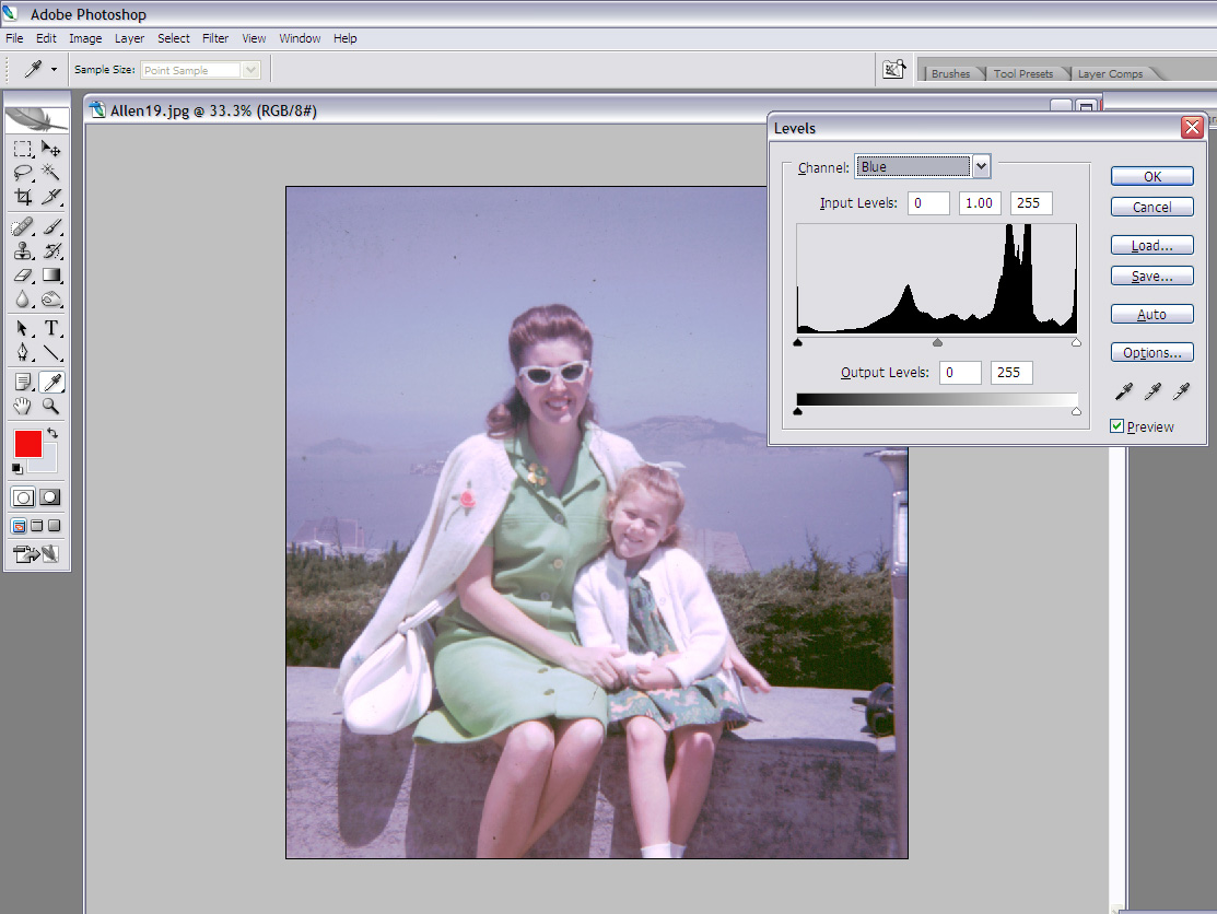
Great, so where do you start? Let’s start with the blues, since that’s the biggest problem.
Go to the ‘Layers’ menu, select ‘Adjustments,’ and ‘Layers.’
In the ‘Channel’ dropdown menu, select ‘Blue.’  You’ll notice the spike in the blue at the same location in the histogram. Start by lowering the shadows. Go slowly. Then lower the midtones. This starts to take out the blue, but adds green and red.
 Then, go to the red or green and start to lower the shadows and midtones until it becomes a balanced picture.
 You’ll notice the spike in the blue at the same location in the histogram. Start by lowering the shadows. Go slowly. Then lower the midtones. This starts to take out the blue, but adds green and red.
 Then, go to the red or green and start to lower the shadows and midtones until it becomes a balanced picture.
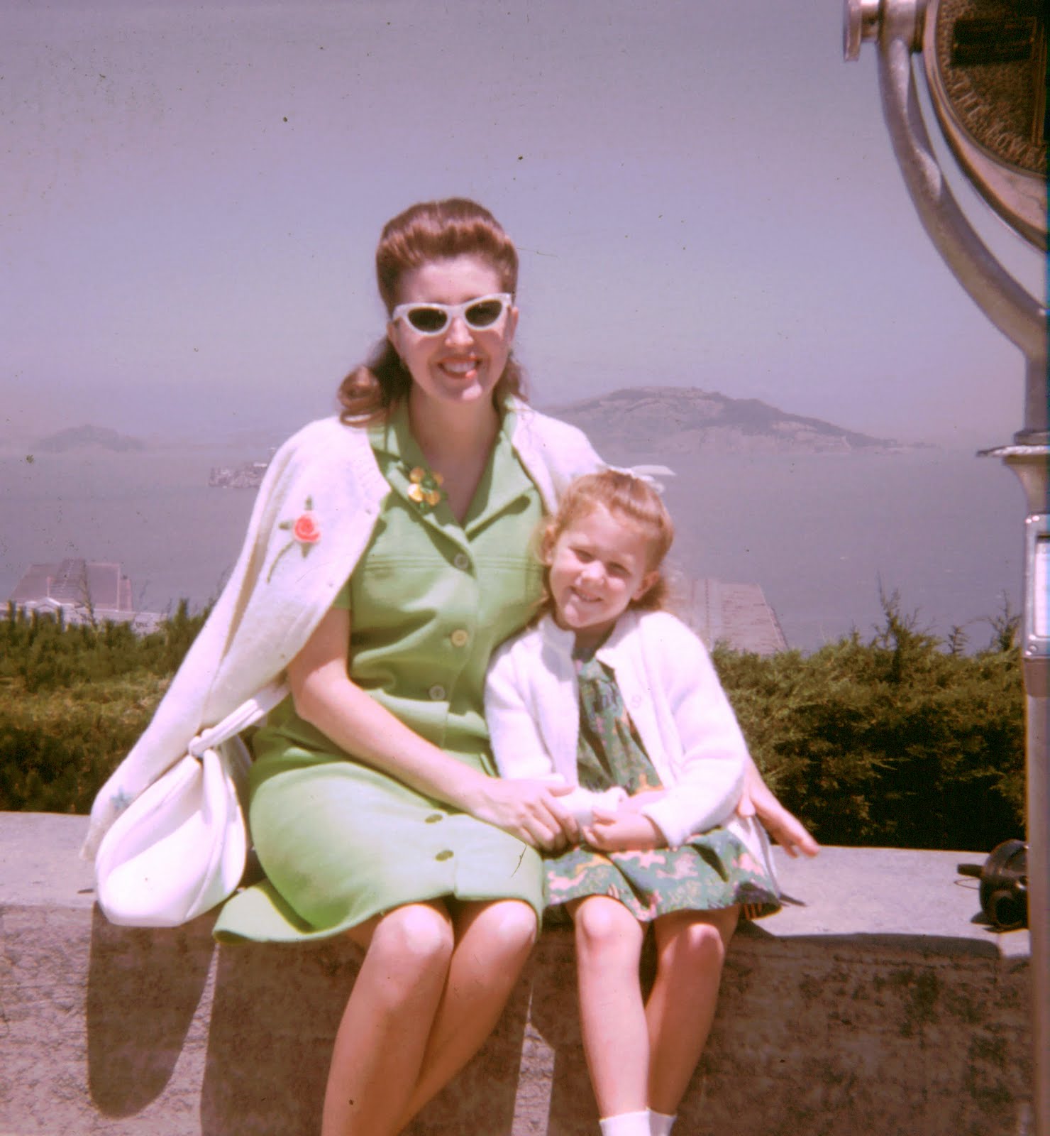
The end result? No, it’s not perfect. That’s because restoring old photos takes many techniques (for later posts), but the color is starting to really show now.
This is one of those techniques that takes hours and hours of practice to really get down. Sadly, it won’t always save your picture. Let’s face it, some pictures are just bad. But, for most pictures, this is a great tool to save an otherwise average picture and turn it into something great.
That is an awesome tutorial. I'll definitely be coming back to this one. Thanks!
Yes, seriously awesome. I am loving your Photoshop tutorials. Thank you thank you thank you!
hi from the TMC! thanks for this tutorial – and this is definitely not basic for someone photo illiterate like myself!
Great tutorial!!! I'm trying to figure out my Photoshop Elements!! I love things that are easy to understand!!
Bookmarking this! Thanks for the gret tutorial.
Stopping by from SITS!
Follow from Friday Follow,
please follow back at http://beonefineday.blogspot.com.
I have been really enjoying photo taking since blogging!~ I did not know you could do all that in photoshop! Very cool and thanks for taking the time to explain, I will try this. Following you now from the friday hop, hope for the same!
Thanks for the quick lesson. Isn't it sad that you don't know who the people are. I have started to label pictures since reading an article that said someone once wrote the dog's name and not the person's name on the back.
Stopping by from SITS.
LisaDay
I LOVE photoshop. I will share some of my work later this week. come check it out!
Also a fellow photographer…
http://www.mvphotography.smugmug.com
(I designed that website, and contribute the photographs!)Enjoy!
Hi! I'm your newest follower.
Come check out my blog!
-Misty
Hi, Happy Friday!
I'm a new follower from Friday Follow.
I can't wait to come back and read through your tutorials. I seriously need help with "fixing" photos!! 🙂
I would love to have you stop by:
http://www.thegiveawaygal.net/
Oh wow you did a good job on that pic! Oh how I wish I had Photoshop! I'm Friday Following you now! Stop by
http://meandmineinasmalltown.blogspot.com/
Wonderful. Thanks for sharing! Checking out what you're up to today. I having my first weekly Button Swap Blog Hop over at my blog where bloggers can swap buttons. Swapping buttons helps bloggers reach new readers and expand their audiences
You can check it out at http://bloggerchixdesigns.blogspot.com/2010/04/button-swap-blog-hop.html
if your interested.
Stopping by from Friday Follow. Already a follower.
Great blog coming from a budding photographer! I'll take all of the advice I can get! Stopping in from SITS.